How to Choose the Right Colour for Your Bedroom Curtains

Updated: 2 days ago
Bedrooms are about rest, intimacy and comfort, with curtains often setting the mood. But when it comes to choosing the colour and fabric for your curtains, some tones work better than others.
Here are our personal favourites
Soft pink and flesh tones
Blush, rosewater and nude tones create warmth without overpowering. They flatter natural light and feel nurturing, ideal for a bedroom that promotes rest and self-connection.

Caramel hues and delicate yellows
Honey, butterscotch and soft marigold add gentle warmth. These tones feel optimistic and comforting without being bright or overstimulating. Stronger tones can be layered in.

Warm, passionate neutrals
Terracotta, clay, cinnamon and warm taupe create depth and romance. They absorb light beautifully and make a room feel layered and intimate.

Curtain colours to avoid (or approach carefully)
1. Stark white
Bright, crisp white can feel clinical and overly reflective, especially in natural daylight. Instead of softness, it can create glare and a slightly sterile atmosphere – more hotel lobby than sanctuary. It also highlights every crease and shadow, which can feel harsh in a space meant to unwind.
2. Washed-out neutrals
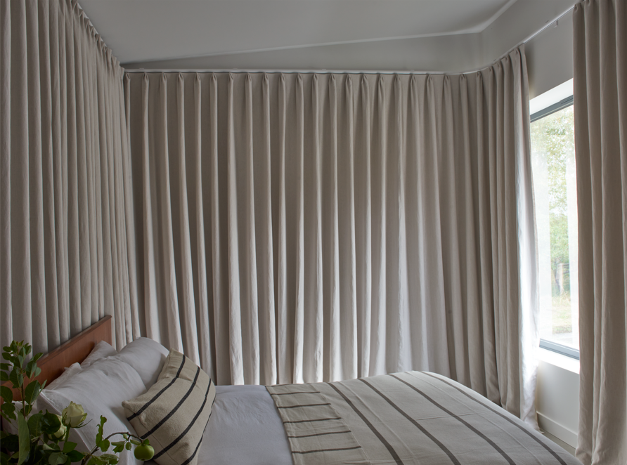
Think overly washed-out, institutional beiges or pale oatmeal tones reminiscent of healthcare or office settings. When a neutral lacks warmth or depth, it can feel flat, impersonal and emotionally cold rather than calming.
3. Cold blues, greys or greens
Icy undertones, particularly blue-based greys or steely greens, can feel emotionally distant. While these shades are often labelled “calming”, when too cool they can feel stark and uninviting, especially in bedrooms without warm lighting. They work better in bathrooms or contemporary living spaces than in intimate sleep environments.
Why these colours don't translate well
• They reflect light harshly instead of absorbing it softly.
• They can feel impersonal, clinical or institutional.
• Cool undertones reduce the sense of warmth and intimacy.
• Bedrooms benefit from colours that cocoon rather than energise.
Can muted versions of these colours work?
• A stark white becomes beautiful when softened into chalk, bone or warm ivory.
• A clinical beige transforms into mushroom, taupe or oat with pink undertones.
• A cold grey becomes inviting when shifted toward greige or a brown-based charcoal.
• A sharp blue works better with warm tones.


Comments